Like all ambitious projects, the Prada Foundation presents ambiguities and contradictions. Established in an old distillery dating back to the beginning of the 20th Century and renovated by Rem Koolhaas’s OMA Studio, this artistic and cultural centre has attracted the attention of tourists to an area of the city totally lacking in appeal, frankly quite ugly and abandoned to post-industrial degradation. In the immediate surroundings of the Foundation the sidewalks have been refurbished, the asphalt is smooth and has a healthy pitch colour, poles for bicycles and scooters have been laid and a functioning parking lot created for visitors. But three years after the opening of the Largo Isarco headquarters there is talk of a cathedral in the desert: simply continue along Via Orobia and you will again be swallowed up by the unhealthy greyness and dreary urban decay of the suburban warehouses.
If the Foundation seems to maintain a patronising detachment with its surroundings, enhancing the area but letting beauty be only cautiously observed and not enjoyed by the neighboring buildings, the same can be said of its interior which again proposes a strange juxtaposition between elegance and poverty, sophistication and oppressiveness, hospitality and detachment, exaggeration and simplicity, decorative and raw materials. Witness to this is the gold-plated exterior of the imperious and blusterous Haunted House, whose interior abandons the gold-plating and gives way to four floors of small rooms with concrete walls, with the exception of one setting in which Robert Gober covered the walls with bright orange and plastic blue wallpaper.
The white Tower, opened this year at the end of April, stands out immaculately against the surrounding landscape, giving the visitor the possibility of admiring, even at a distance, its delightful play of volume and geometric shapes: its lines are simple but clever, its mass balanced and reasoned like those of the statue of an ancient Greek athlete, so much so that almost no one notices the powerful aesthetic effect that comes into being while observing the recesses, the balconies and the pillar diagonally lodged into the Depot. The façade, which can be admired from inside the courtyard, is, in a few words, a vertical rectangle where four horizontal rectangles of the windows, which increase in heights, are laid out to the right. At its base the building is excavated from a trapezoidal area which welcomes the visitors while its surface is decorated with a square grid in barely visible bas-relief, suggesting order and formal purity. The side of the building bordering via Lorenzini has, in fact, a more rippled effect due to the shifting of the balconies with respect to the Tower line.
Inside lies “Atlas”, part of the permanent collection, a project spanning six floors conceived following a conversation between two exceptional celebrities: Miuccia Prada (bien évidemment!) and Germano Celant. But how can we define “Atlas”? A scientific mapping of contemporary art? A collection, which like the titan Atlas can bear the historical weight of the late twentieth century, or the rewriting of the Prada collection, a sort of postmodern wunderkammer? Possibly all of these put together. Of the nine floors which make up the building, six are designated for the exhibition, one for the cloakroom (the first floor) and two for the kitchens, café and restaurant. From the latter visitors can enjoy a spectacular view of downtown Milan and admire works of art by renowned artists namely: Lucio Fontana, Thomas Demand, Carsten Höller, Mariko Mori, Jeff Koons and many more. It is precisely with Koons that the visit of the Tower begins: at the door of the second floor the viewer is sinuously greeted by the shining tubular stems of his “Tulips” (1994-2005) which blossom into swollen stainless-steel petals, mirrors for the hedonistic. In the finest “Koonsian” tradition, the feeling that runs through those who observe this work is that of deep satisfaction, like taking a mouthful of a tasty but uncomplicated dish for sheer appetite and fancy. Accompanying these gargantuan tulips is the view from a windowed wall of the railway station to the north, overwhelmed by weeds, adjacent a skyline of low income buildings with faded grey façades, or other improbable yellowish, greenish, pinkish, slightly depressing shades. Koons’s American dream is coupled with paintings by Carla Accardi which hang on the plywood covered walls: at first sight these works almost seem to slap us in the face due to the brazen use of synthetic materials (specifically sicofoil, a transparent plastic) and bright and sharp colours (in the three works produced in 1967, “Verdenero”, “Giallorosa” and “Rossonero”). But then the eye is soothed in its contemplation of the composition, in the mindful vibration of the lights on the two-toned waves painted on the plastic canvas, or on the woven strips in “Grandi trasparenti” dated 1976 (and in the 1975 version as well), where the wooden cross-shaped structure supporting the canvas is also displayed (the latter has here been replaced by the rippling intertwining of the sicofoil strips). We can observe the subtle difference between these two artists: that which distinguishes the basic from the simple.
Each floor runs perpendicular to the previous one: the third floor thus gives us the possibility of enjoying a view of the courtyard of the Foundation as well as being the only one that hosts a single artist, Walter De Maria. De Maria, although renowned for his creations within the boundaries of Land Art, is here associated with two completely different types of works. The first, located on the left of the entrance to the room, is inserted in a sort of plywood niche, reserved and intimate, and is part of the minimal research which characterised the first part of De Maria’s career. “Eros Ion” (1968) is a metal parallelepiped that stands out in the middle of the wall, confined to its own shape. Here the dynamism of the diagonal line of the long sides is closed and compacted by the horizontal line of the lower and upper short edges. At intervals the steel almost seems to have been lodged into the soft wall behind it, but the light of the sun coming from the other end of the room makes it vibrate, distancing it from materiality: the brightness poetically combines with the lunar shape of this object, which, like an icon, seems to ultimately transcend and speak to our soul from its stellar distances. The result is suspension between a profound and unreal dimension and a current and tangible one. The title itself is a play on words between “eros”, “ion” (a molecule or electrically charged atom) and “erosion”: between the possible and the eternal, the visible and the invisible. Another diagonal line cuts the rest of the room: it is formed by the alignment of three 1955 Chevrolet Bel Airs. “Bel Air Trilogy” (2000-2001) recalls an unlikely car dealership where the cars have been polished to enhance their chrome plating as well as the aesthetics of each single studied detail, creating a clear colour contrast between the bright red of the hood and the cream colour of the trunk. The wheel rims have also been dyed with the same colours. The interiors are also impeccable, so much so that the visitor could and would like to sit comfortably inside these collector’s items if it were not for the fact that a metal bar, casually inserted into the glass, crosses each vehicle from the windshield to the rear window, thus expunging the appeal and comfort for the driver and the passengers. The three bars have different sections that take the form of the three basic geometric shapes: the square, the circle and the triangle. The Chevrolets are impossible to drive not only because of the presence of these long intruders, but also because their wheels have been deflated, the rear-view mirrors detached and the engines removed. We are therefore in the presence of objects that have not only lost their functionalism, but whose context and raison d’être have been removed. If the bar crossing could recall works such as “Madonna” by Robert Gober (1997), the latter, precisely because it questioned the iconography of the Virgin, fuelled its interpretation with different methods. At this point, the cars prove to be only a stockpile of matter: beautiful, shining, elegant, very American, but ultimately matter. This matter, so well organised in a 1955 Chevrolet, finds in its nullification a place in the universe beyond the automotive world, as if the metal bar could simultaneously act as an instrument of measure, a measuring tape of this “car-structure” in space and as a motion carrier in time. It is the measurement and the definition of an object reduced to a monad and in this sense, it reconnects to the work with which it shares the floor.
To be continued …
Simone Costantini
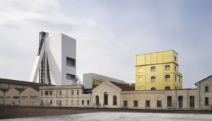 Torre Fondazione Prada, Milan Architectural project by OMA Photo Bas Princen 2018 Courtesy Fondazione Prada
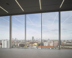 Torre Fondazione Prada, Milan Architectural project by OMA Photo: Bas Princen 2018 Courtesy Fondazione Prada
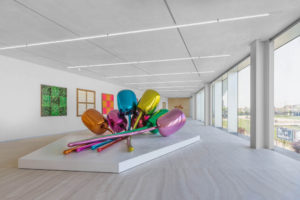 Exhibition view of “Atlas” Torre – Fondazione Prada, Milano Photo Delfino Sisto Legnani e Marco Cappelletti Courtesy Fondazione Prada / in the foreground: Jeff Koons Tulips, 1995–2004
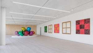 Exhibition view of “Atlas” Torre – Fondazione Prada, Milano Photo Delfino Sisto Legnani e Marco Cappelletti Courtesy Fondazione Prada / from left to right: Jeff Koons Tulips, 1995–2004; Carla Accardi Verdenero, 1967; Carla Accardi Grande trasparent, 1976 ; Carla Accardi Giallorosa, 1967; Carla Accardi Grande trasparente, 1976; Carla Accardi Rossonero, 1967
 Exhibition view of “Atlas” Torre – Fondazione Prada, Milano Photo Delfino Sisto Legnani e Marco Cappelletti Courtesy Fondazione Prada / Walter De Maria Bel Air Trilogy, 2000–2011
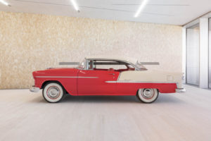 Exhibition view of “Atlas” Torre – Fondazione Prada, Milano Photo Delfino Sisto Legnani e Marco Cappelletti Courtesy Fondazione Prada / Walter De Maria Bel Air Trilogy, 2000–2011 (1 di 3 elementi)


NO COMMENT