Since its appearance, cinema is considered one of the most important discoveries and inventions after printing, capable of overcoming any other form of representation in rendering directly reality. Among the characteristics that we can find in the cinematographic medium there is certainly the emphasis on communication: cinema, in fact, presents itself as the perfect combination of old technologies and new worlds to be explored and is able to offer the public images, from which it is impossible to escape.
But what could happen, if nowadays, contemporary design takes its cue from a piece of history of international cinema and consequently asks animation itself to be the spokesperson for its communication? Well… a perfect and evolved combination would come out of it.
Andrea Branciforti, architect, designer, lecturer and currently President of ADI Sicily, for Orolavico, an Etnean company specialized in the processing of lava stone, decides for his latest Odyssey Collection, to be inspired by 2001: A Space Odyssey by Stanley Kubrick (1968), from which a new dishes line of 15 placemats is born, made up in turn of six micro-collections.
Branciforti starts right from the studio of Stanley Kubrick, the great director who never missed an opportunity to focus on the details, the studied shots, so perfect and geometric. In 2001: A Space Odyssey, where past, present and future seem to meet and never collide, a series of direct images follow one another beyond infinity: the monkey holding the bone, the black monolith, the red of Hall 9000, the unnatural white of the room with the Empire-style furniture and the futuristic elements that form the background to the body of astronaut David Bowman and the black monolith.
After studying the director and analyzing the screenplay of the film, Branciforti returns to his origins: Sicily, a land that, thanks to the constant activity of Etna, offers us not only visual and sound shows, but also matter, the lava stone. A lava stone that makes a journey, from nature, to transformation into a design product, up to the completion of the mise en place of our tables. A design collection, as contemporary as it is eco-sustainable, from which 15 underplates come out, whose textures and decorations lead us back to Kubrick’s film; the nuances, that is the gradual passage from one color to another, are obtained with an eco-sustainable laboratory procedure that allows the creation of the color palette from a single base glass that reproduces shades present in nature and which are not present in the more well-known color scales (Ral and Pantone).
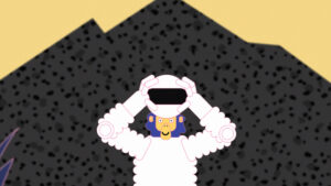
Branciforti, moreover, to continue the work and finish it on the path of animation, collaborates with Adriano Di Mauro, a young artist and illustrator, who through a utopian language and the use of 2 D frame by frame animation, tells us the intentions of the designer in the promo video for the Branciforti collection. The scenes of the video are set between the Universe and the Earth, in Sicily, and they see as the protagonist an astronaut-monkey-man who comes across Branciforti’s collection and typical Sicilian street food, but his journey does not last long because he is sucked up by Hal’s eye and taken to a world where anything can still happen.
Mery Scalisi: From what thought came the desire to meet the world of video animation for your Odyssey Collection?
Andrea Branciforti: For the Odyssey Collection I wanted the communication to be ironic but not trivial, therefore, we decided to re-read the film by Kubrick, 2001: A Space Odyssey, through the flat language of illustration. We have abandoned the visual and audio format of a more formal and institutional advertising campaign, leaving to the dialogue between design, visual art and cinema the task of guiding the public in the reading of the concept, the idea behind this project. That of animation seemed to me an interesting path, so we involved, with the communication studio, the artist Adriano di Mauro who was able to transfer my thoughts into the video, enhancing the references to the film of the great master of cinema and introducing some elements linked to the line of lava stone placemats.
Were there other great masters, like Kubrick, who helped / inspired you in the process of making your works?
I think that, in general, it is the images that strike us. Whether it’s film images that often have a photograph that mesmerizes our minds, or landscapes that show the extraordinary perfection of nature, or architecture or design objects that we see daily in the city we live in, during a trip, etc… Everything that captures our attention, in some way, remains within us, we metabolize it and make it our own and, when we least expect it, it comes back to the surface, becoming a source of inspiration for a new project or a new idea.
According to your latest experience, to what extent do you believe that video animation, as a means of communication, can help contemporary design?
Video animation as an artistic medium and as a form of visual communication is very interesting because, undoubtedly, it manages to transversally stimulate the imagination of the public, even those less accustomed to this specific expressive code. In our case, we chose a flat language, therefore a simple, essential, two-dimensional, immediate language made up of vibrant and bright palettes, often of primary and secondary colors, which would allow us to tone down without ever debasing or trivializing some very important and current concepts addressed by Kubrick in his 1968 film, “2001: A Space Odyssey” which greatly inspired future generations and the political-social choices of the following decades.
Mery Scalisi: Communicating a design collection through video animation, your world. How did you welcome the proposal of the designer Andrea Branciforti?
Adriano Di Mauro: When I saw the design of the collection created by Andrea Branciforti I immediately thought that it would be very well linked to my animation style. I think the most important step was getting the elements to communicate by meeting in a single graphic style.
What are the principles that a good video animation should possess for the success of effective communication?
In my opinion, the message you want to convey is the first piece that underlies every animation. In this case the script and, subsequently, the storyboard are the most important structures for a successful communication. Synthesizing project ideas into moving images that we then see on a screen is the key to the whole process. Everything else may very well be a secondary step.
Mery Scalisi: Are there any masters of cinema, Italian or not, from whom you draw inspiration for the creation of your video animations?
George Lucas’s films are among the ones I loved most as a child; their fine line between cinema and comics has always fascinated me. Speaking of animation, however, Bruno Bozzetto was among those who most influenced my early works. I am very attracted to the animations of Lorenzo Mattotti, Wes Anderson and Hayao Miyazaki. Currently, my biggest source of inspiration is Richard Williams, whom I admire very much for the enormous contribution he has made to the world of animation.
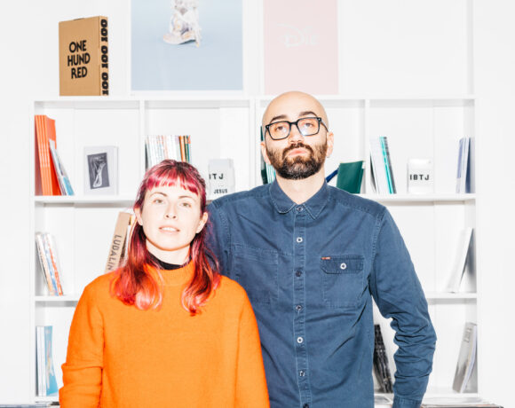
 Andrea Branciforti
 Odyssey Collection by A. Branciforti – Orolavico – 2021 – ODYSSEY – Ph E. Liggera
 Adriano Di Mauro
 Frame, Odyssey, 2021, video animazione by Adriano Di Mauro per Orolavico
 Frame, Odyssey, 2021, video animazione by Adriano Di Mauro per Orolavico

Graduate in Communication and enhancement of the historical artistic heritage and specialized in artistic design for the company, works in close contact with contemporary art, making this the key to reading for every work approach to which you moves. Art is life the motto around which her work / artistic experience revolves.


NO COMMENT